Kaggle is a Data Science community where thousands of Data Scientists compete to solve complex data problems.
In this article we are going to see how to go through a Kaggle competition step by step.
The contest explored here is the San Francisco Crime Classification contest. The goal is to classify a crime occurrence knowing the time and place it happened.

Here, the objectives are fixed by Kaggle. In general, when starting a Data Science project, one of the most important steps is the business understanding and the definition of the scope and objectives of the project.
Data understanding :
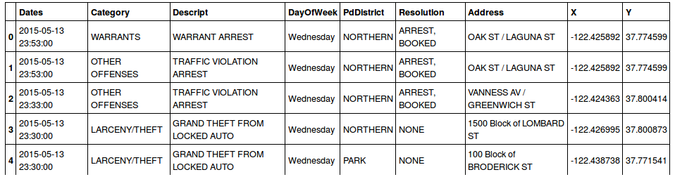
For data exploration I like to use IPython Notebook which allows you to run your scripts line by line:
import pandas as pd
df = pd.read_csv('train.csv')
len(df) #884262
df.head()
We have 800k data points in our training set covering about ten years of crime. We have enough data points. No need to search for other sources to complete our training set for now.
A simple pandas function which allows to find outliers in the data is :
df.describe()
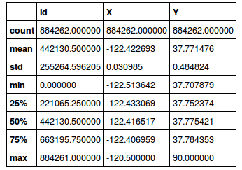
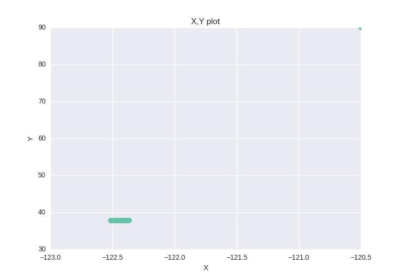
Looking at this description we can think that we have some outliers in the data. A x,y graph plot confirms the outliers hypothesis.
plt.plot(df.X,df.Y,'o', markersize=7)
Here we don't have any missing data , but it's very important to look for missing values in your data. We 'll see how to deal with them in the next step.
empty = df.apply(lambda col: pd.isnull(col))
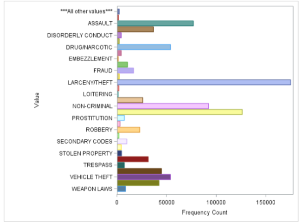
When cleaning the data it's also useful to draw histograms of different categorical attributes to see if some categories are under represented.
In the visualization below, every line represents a category of crime. Each point shows the number of crimes of a category within a year window. This representation shows that the year is important in determining the crime category. For example, looking at the yellow line (car thefts) we see a notable decrease over the years. We can do the same plot for months, hours, days of the month, days of the week... (using the timestamp attribute).
[caption id="attachment_162" align="alignnone" width="709"]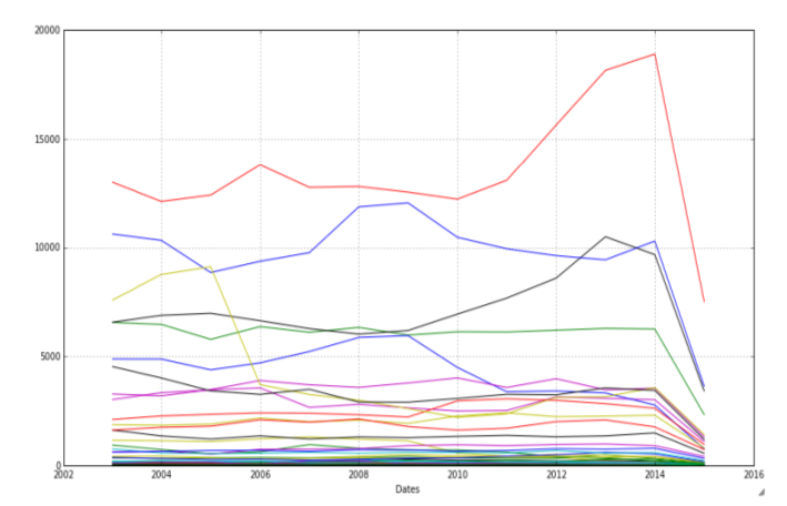 Frequency of crime categories per year per crime category[/caption]
Other data exploration and understanding techniques:
- Boxplots for outliers detection
- Scatter plots and scatter matrix to see attribute correlation and distribution.
Data preparation :
Sometimes, when training your models, it's a good idea to sample the data and take only a part of it for training. Some models have a big computation cost and would take forever to run with a large number of training points.
Dealing with outliers and missing data
When preparing the data we have to decide what to do with the outliers, or missing data. Should we delete them ? Or predict the values ? There is no correct answer. If your objective is to optimize a performance indicator then you should try both solutions and choose whichever one gives the best performance result.
Feature engineering
Feature engineering is a good way to climb the Kaggle leader board. You can come up with smart combinations of attributes and build new ones depending on your "feeling".
For example in our data, we have an address column which contains either a street address or a crossroad. We can create a new feature crimeHappenedInCrossRoad that contains true if we are in a crossroad and false in the other case.
More evident features to add : the date columns. We can use the timestamp column to get the year, month, day of month, day of week, hour, minute of the crime. Of course some of these features can be useless and could even harm your prediction score. Choose wisely!
Formatting the data
Some Predictive Models and some implementations of Predictive models do not allow the use of nominal categories (like our District Column). A simple way of getting around it is to binarize this attribute.
df = pd.concat([df,pd.get_dummies(df['PdDistrict'])], axis=1, join_axes=[df.index])
Data Analysis :
==================
In order to improve your Kaggle score you have to try different models and algorithms. For every model, you can try different feature sets and data pre-processings.
If you 're using a scripting tool, you can write a script that would take the different data pre-processings as a parameter and automate the testing.
Below is a plot showing the performance of Random Forest Trees using different data pre-processings.

Next, you have to optimize your algorithm parameters for the best prediction. Some libraries and tools can do the job for you (like the scikit-learn grid search).
[caption id="attachment_225" align="alignnone" width="550"] Logloss representation for different values of Random Forest
parameters[/caption]
Logloss representation for different values of Random Forest
parameters[/caption]
I also wanted to share a library that I recently stumbled upon, theREP library. It's a python library that offers wrappers for popular Machine learning libraries like Scikit Learn, XGBoost, Theanets, Neurolab and PyBrain. This library can simplify your automation scripts to test different libraries with the same code but it also allows you to combine the libraries tools. Like for example running bagging over complex algorithms or boosting Neural nets !
base_xgb = XGBoostClassifier(n_estimators=20)
ada_xgb = SklearnClassifier(AdaBoostClassifier(base_estimator=base_xgb, n_estimators=5))
ada_xgb.fit(train_data[variables], train_labels)
Data visualization :
One of the objectives of the competition was to build visualizations to help getting insights from the data.
Below are two 5-dimension maps showing crime "trends" depending on the hour of the day for the first map and the year for the second one.
The longitude is coded on the X axis
The latitude on the Y axis
The crime category is coded by the color
The crime frequency by the opacity
The time (hour/year) is shown in the animation.
[caption id="attachment_243" align="alignnone"
width="946"]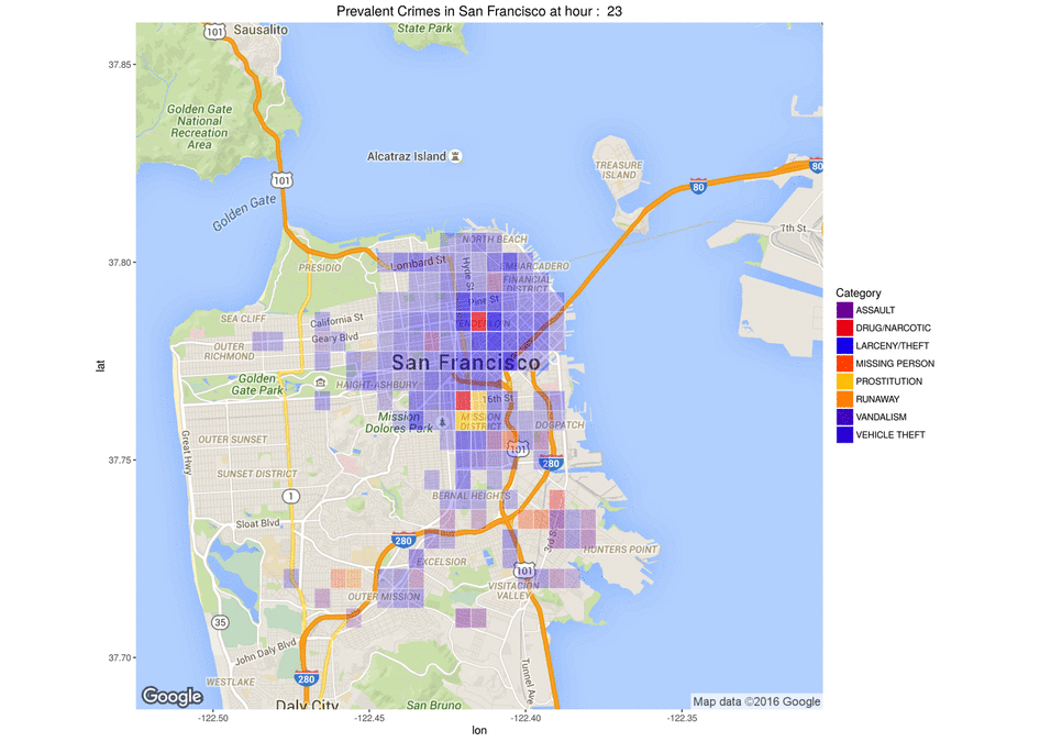 Map showing the frequency of crimes per category per hour[/caption]
[caption id="attachment_244" align="alignnone"
width="1211"] Map showing the frequency of crimes per category per year[/caption]
Conclusion :
Don't be scared to start a Kaggle competition. Start by submitting a first version without optimizing your algorithms too much. Then, once your work flow is clear, you can add new algorithms, new features and features-sets to climb the Kaggle leader board.